Logos


Branding
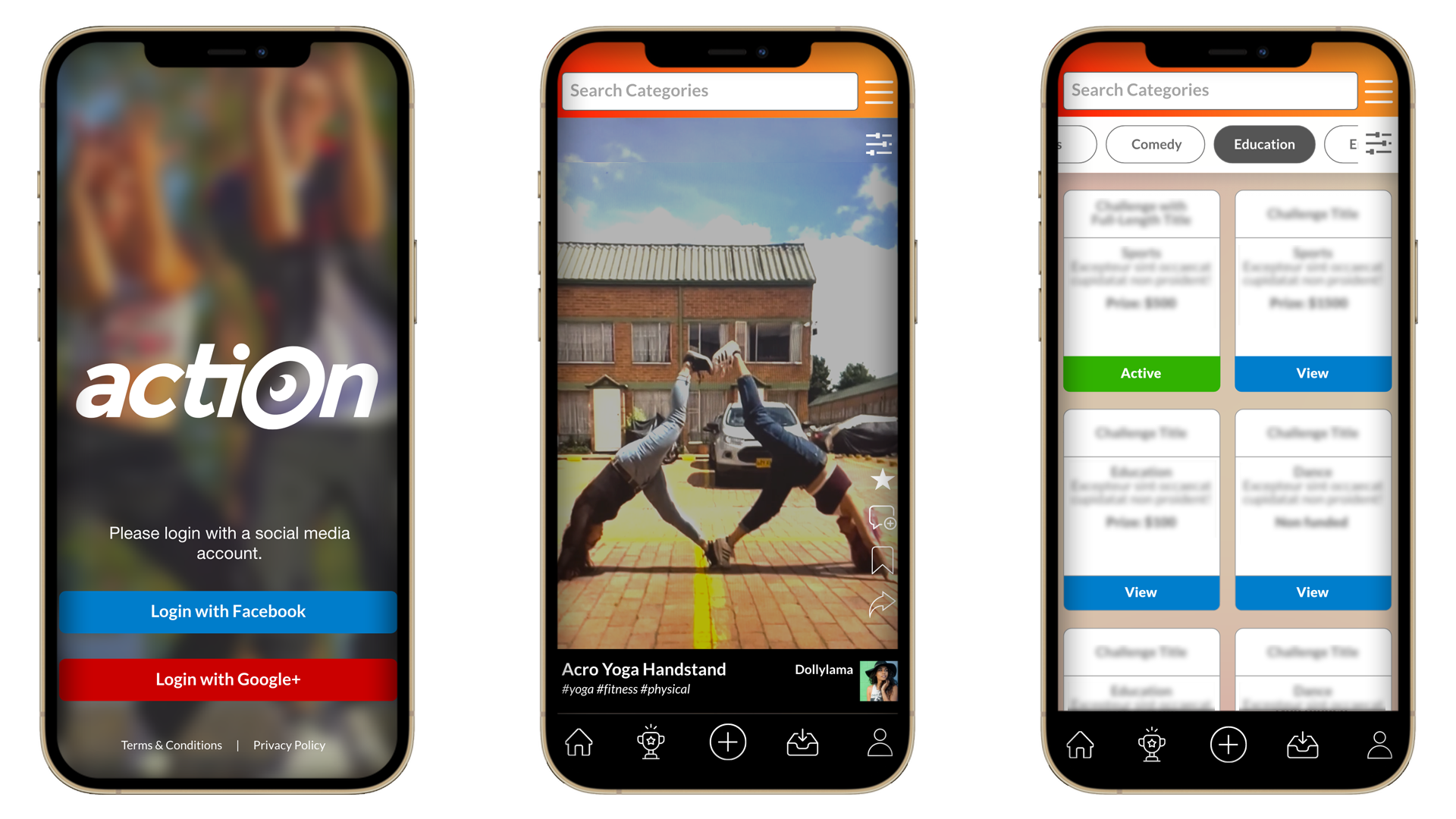
Action Social App
UI/UX & logo design for social media challenge app
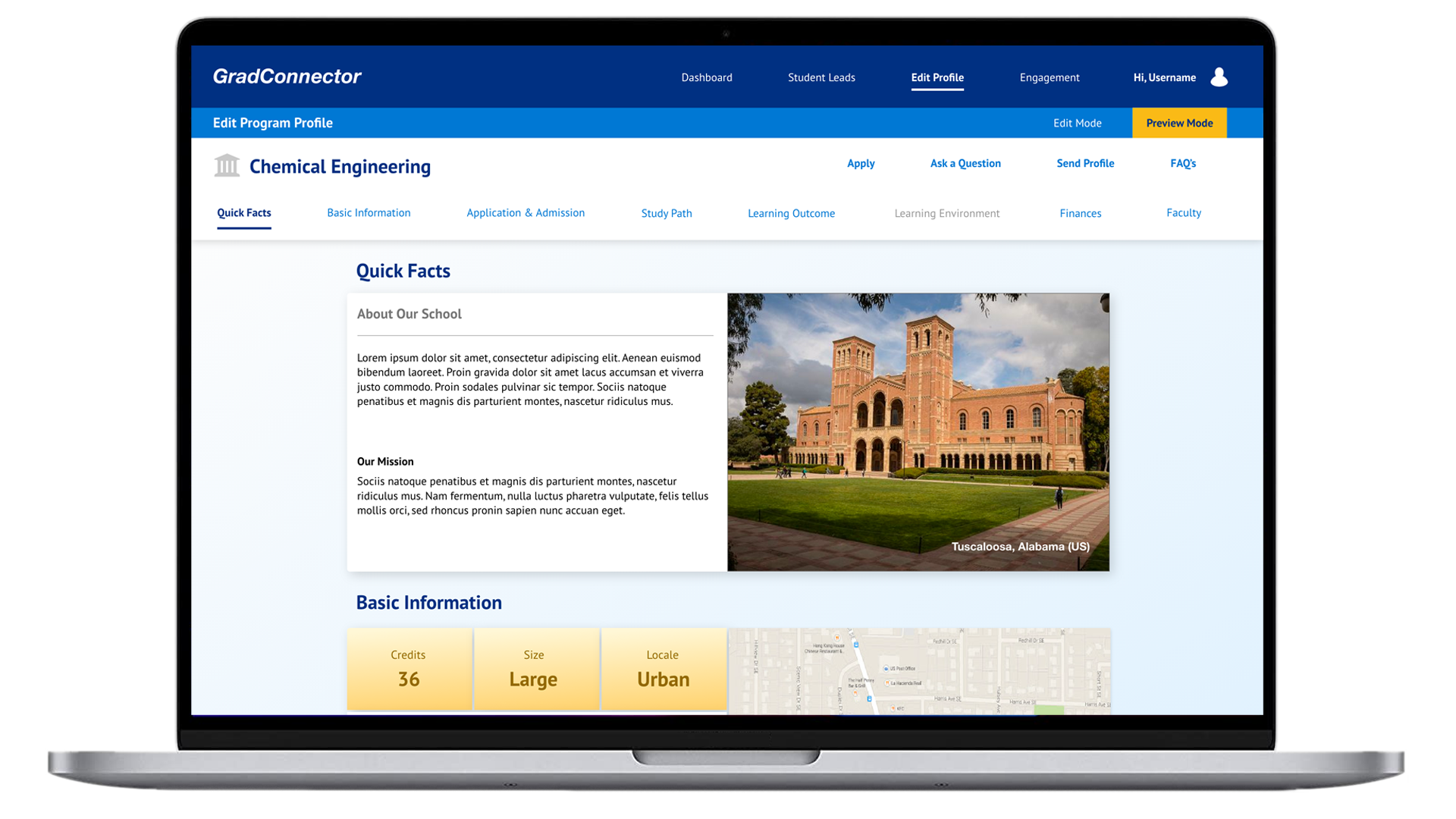
Grad Connector
UI/UX design and wireframe prototyping for a graduate student/graduate program search & match solution
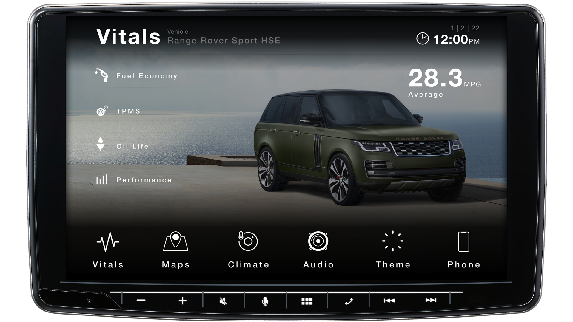
Coupe® Infotainment Interface
UI/UX design for automotive infotainment user interface concept
Kermit Pannell
UI/UX Designer
Front-end Developer
215.317.0645
215.317.0645
kermit76@gmail.com
 pdf
pdf

SKILLS
I am proficient in the HTML, CSS/SCSS, JS technology stack including Foundation and Bootstrap Front-end frameworks. I have experience with Angular and React JS frameworks, along with development repository platforms such as Gitlab and Github. Expertise in design and solution prototyping tools including Axure, Figma, Sketch, Adobe XD, and various Adobe Creative Suite software such as Photoshop, Illustrator, After Effects, etc.. My focus is on UI/UX design/development best practices including responsive design and accessibility standards, with several years of experience in Agile work environments.
EMPLOYMENT HISTORY
ETS - Princeton, NJ
Front-end Developer/UI Designer | 2019 - present
As part of the Application Design Team at ETS, I work directly within product development and research lab teams performing the duties of UI/UX designer creating wireframes and interactive prototypes to support user research, as well as inform application development. As a Front-end developer, I am responsible for branding/style guide implementation and user interaction development for applications developed in Angular. I also have experience with .slim templates via Ruby/Rails. I lead and participate in formal Agile practices such as design sprints, user-persona development, and various workshops related to feature development, as well as conducting user research interviews with education professionals and prospective/active students.
Jefferson Health - Philadelphia, PA
Front-end Developer | 2018 - 2019
Part of the Jefferson Health Digital Innovation & Consumer Experience group, (DICE). Responsible for Front-end development tasks including the Sydney Kimmel Cancer Center website redesign using current development coding standards, front-end frameworks such as Bootstrap 4 and content management via AEM (Adobe Experience Manager). Implementation of peer-informational course series highlighting accessibility compliance for web design. Initiation of on-boarding mentoring efforts to improve and encourage new employee acclimation, engagement and growth.
Fanatics - Conshohocken, PA
Front-end Developer | 2014 - 2018
Responsible for front-end development tasks in the sports retail domain. Worked as part of the development team for major e-commerce clients such as: NFL shop, NBA store, NHL and MLB shop. Frequent collaboration with designers and business leads to support an enhanced online shopping experience.
Leadnomics - Philadelphia, PA
Graphic Design/Web Developer | 2014
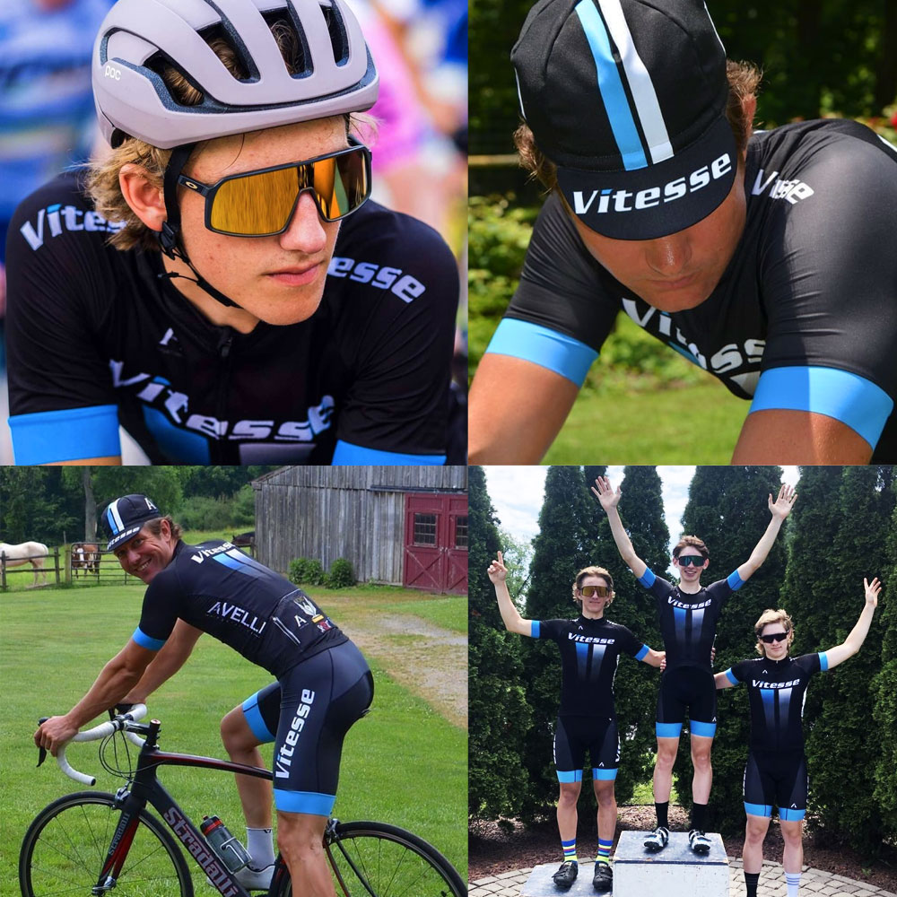
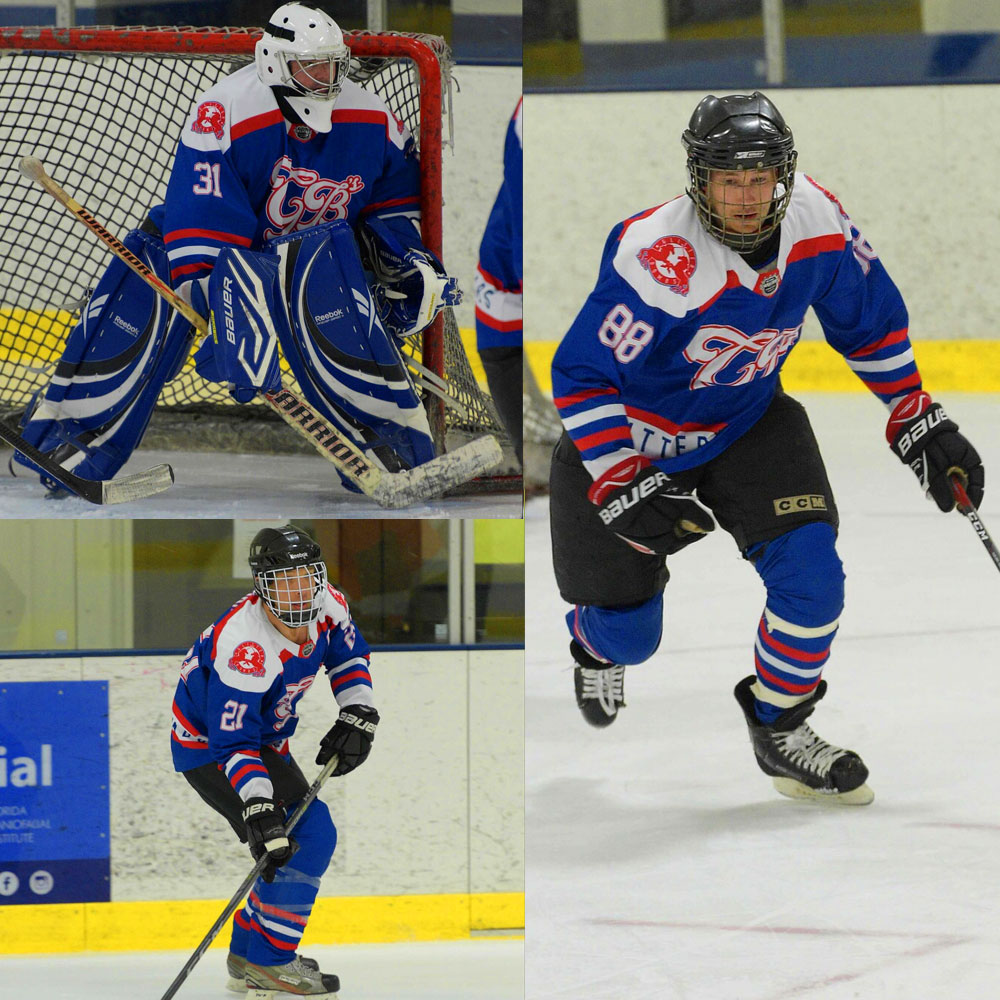
Responsible for the creation of info-graphics, web-based advertisements, branding conceptualization and standardization, with a digital-marketing agency focused on target-market research and brand development.
IBM - Philadelphia, PA
Web Developer | 2009 - 2013
Responsibilities within the collateral management product division ranging from Front-end development, to maintaining enterprise and client branding standards. Info-graphic design supporting application semantics such as user interaction, functionality and security protocol.
Performance Development Group - Malvern, PA
User Interface Designer | 2008 - 2009
Responsible for user interface design, motion graphics and training module authoring using Adobe Flash and ActionScript 3.0 for various e-learning platforms, focusing on the development of intuitive UI to best serve client training goals.
Boyd Tamney Cross Advertising - Wayne, PA
Web Designer | 2007 - 2008
Web development, UI design and branding solutions focusing on cost-effective marketing and rapid product delivery.
Soft Assist - King Of Prussia, PA
User Interface Designer | 2002 - 2004
User interface design and development of e-Learning applications utilizing various design tools ranging from Adobe Creative Suite to 3D Studio. Maintenance of branding standards for clients including Black & Decker, Home Depot, Exelon Energy and University of Pennsylvania Health Systems.
EDUCATION & TRAINING
Art Institute of Philadelphia
Associate of Animation & Multimedia
Codecademy, LinkedIn Learning, Pluralsight and Udemy course completion in various UI/UX design and Front-end development related competencies
INITIATIVES
Code4PA Code-a-thon technology solutions to combat opioid epidemic
Web Accessibility standards and practices workshop series
Fund raising organization for various initiatives
New team member onboarding and peer-mentoring initiatives