Harmonic Design System
Education Testing Services - ETS®
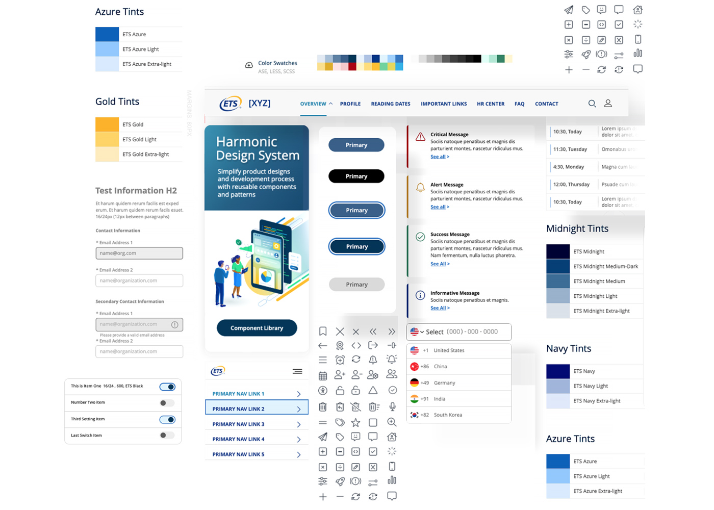
A design system is essential to any software design entity. Operating at a global level and serving various markets worldwide with competitive assessment applications, the continuous need for a centralized component design library was crucial. The Harmonic Design System would improve ease of use and access for designers, developers and marketing specialists, along with supporting a homogenized look & feel and brand identity across all ETS products and platforms.
- Target Users
- Application Developers
- UI UX Designers
- Marketing Specialists
Objective
With the end goal ultimately being a set of resources for designers to reference during the design phase, developers to leverage code, and supporting guidelines for marketing materials. The need to stand up each of these resources in a coherent, easy to access and interpret platform was born.
The ability to serve multiple platforms with regards to development (Angular, React...) as well as drag and drop ui components for UI/UX design tools (Axure, Figma, Sketch...) would encourage the team to keep portability of these components as a primary target.
Challenges
The UI designs were initially created by a firm that was sourced to provide a design style for a large portion of our appliction design aesthetic. Most elements from button styles to form fields and typography were designed out of the box, but as we began to explore the wide range of UI elements to suit our needs specifically, gaps were identified.
The design specifications inherited from design group, while giving us a foundation to base new UI designs on... was not the apples to apples match in various instances. The task of bringing new designs to fit with the designs provided was a priority before moving forward.
The need to preview the UI elements in a real world layout and find issues before proceeding the development spec was a primary task for myself and the designer(s). This would then inform the literal translation of design specification to front-end development specification and component documentation
Solution
Design Library
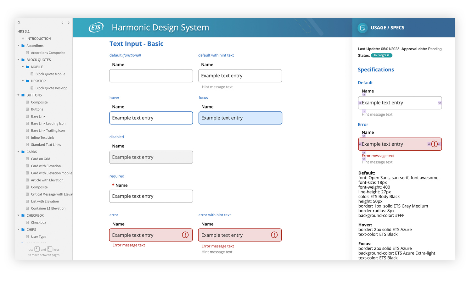
A solid reference point for designers to take direction from was the first big undertaking with myself and designer(s) taking account of all UI elements that needed capturing in this version of the design system. Once the outline of the design library was complete, we could approach applying like for like properties to elements such as spacing, border/outline widths, error styling, etc.
Component Library
The component library could only be as solid as the design library itself making that intensive initial effort payoff in many respects when it came to speccing and thus building front-end components for application development. Translating common design language to cooresponding front-end speak (converting to specific HTML/CSS/JS identifiers) was my primary task.
The need to support multiple front-end frameworks had us start with Angular, using Material UI as a base for our eventual custom components. Creating custom classes that leveraged our own styling specs inplace of Material UI provided the freedom of employing the ETS design systems parameters without the need to develop an entire front-end UI library from scratch. Making the compatability and turnover of completed component designs that much smoother.
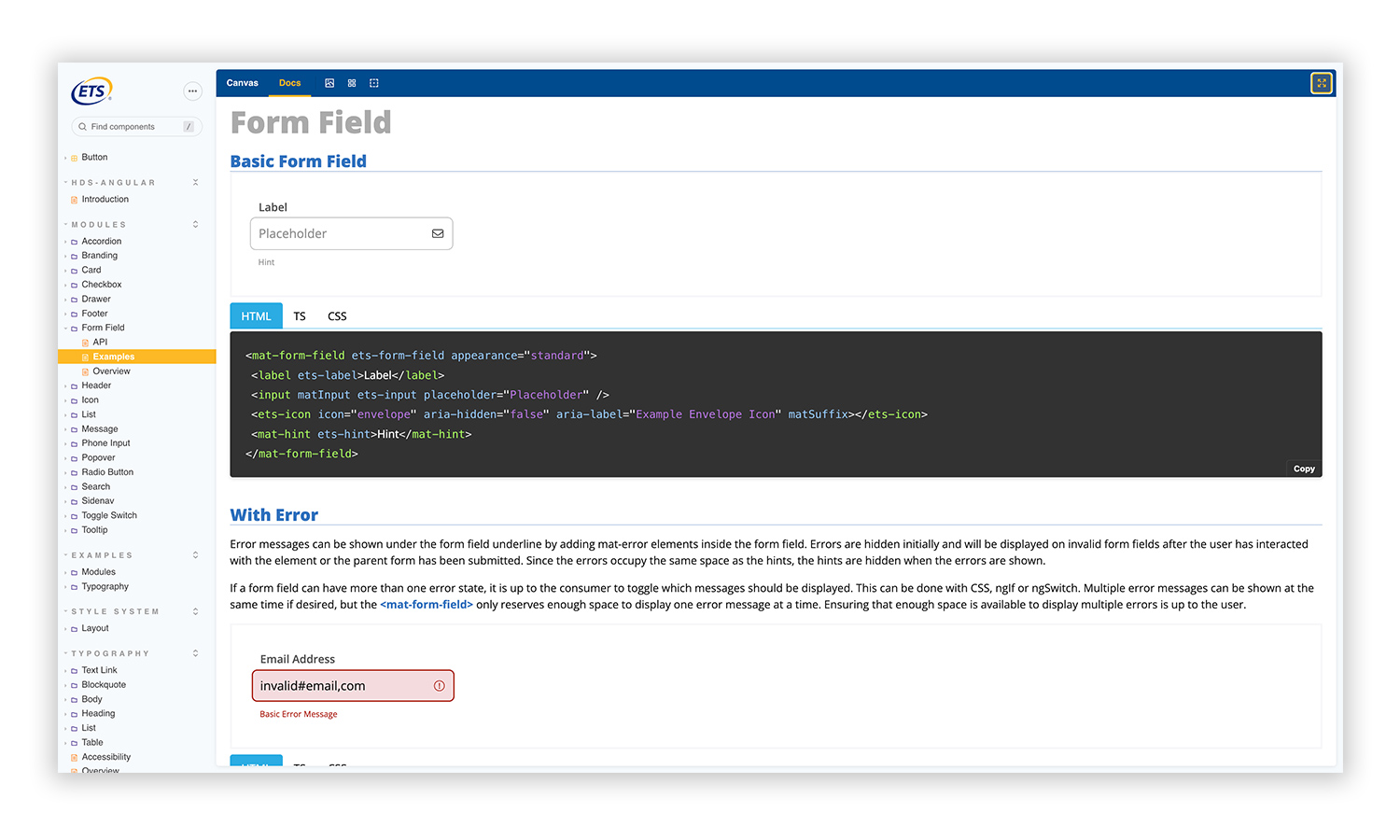
Drag and drop ability of these components and their respective code markup was a goal to satisfy not only the need for developers to have a quick and easy place to grab UI elements as needed, but also showcase the components in a web environment representative of how they should render in an application build. Storybook JS provided such an environment allowing us to catalog these components in isolation as well and compiled boilerplate samples of page layouts supporting developers as they build screens. Storybook would ultimatley become our proving grounds for component development as testing and troubleshooting could happen there before getting to the app dev workstream.
Harmonic Design Component Library ››
Documentation
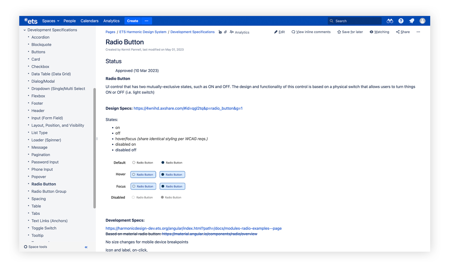
Along with the design and component libraries is the documentation per which all these components were designed and intended to be used. Myself and the team at large worked to nail down not only the component properties but also document functionality, use cases, accessibility protocols, source references, etc.
Eventual owenrship of the documentation was between myself and the project BSA. More frequent updates based on troubleshooting in the development phase were capture by myself with BSA approval following.
As a living resource, maintaining the documentation and making sure any updates were filtered into development and/or revised in the design library was important part of keeping the integrity of specifications across the board.
Final Solution
With the ultimate objective being a coherent and seamless set of resources for access per any relevant role... the team was able to stand up several facets of the design system over the course of 6 months. This would provide application design teams with ready to go out of the box UI components, designers a clear and easy to access style guide to support UI/UX design and wireframe creation, and a reference for marketing teams to keep outgoing materials on-brand and within the design system guidelines.
Conclusion
The final deliverables of the Harmonic Design System were intended to provide resources that take the guess work out of the design, development and marketing processes related to application design and it's supporting materials. ETS has since moved forward with new branding as of 2024, but the resources put in place to serve the forementioned outlets was still applicable in most cases.
Some of the development pain points of creating a custom UI component library eventually proved to be learning experiences. Iterating on the coded solution itself allowed the development side to reach an more efficient structure that could be sustatinable within other platforms.
The overall success of the Harmonic Design System was measured not only by application development teams willingness to engage and make use of the system, but also by its use of current technologies making it a portable system to be integrated into almost any technology stack.
