Online Network for Evaluations - ONE
Education Testing Services - ETS®
ONE is a system for Raters to score/rate test taker responses in various formats including written, audio recording, PDF format, or images depending on the program or test type.
- Target Users
- Evaluation Raters: Primarily tasked with scoring test taker responses. Training & Calibration on prompts is also a regular requirement.
- Rater Administrators: Oversees several raters and their scoring assignments while providing scoring feedback, answers to questions from raters, scheduling, etc.

Problem
The main areas a Rater is performing daily functions are between scoring and training, with the occasional need for recalibration (refreshing the Raters usage of the scoring rubric).
Outside of those primary functions, the Rater will use other features of the application including reviewing feedback from the Scoring Leader, reading messages, chat and various other resources. However, the existing workflow for the Rater was limited as far as engaging other areas of the application without having to leave a current scoring or training set of tasks.
Along with giving the user more freedom to view supplementary information while maintaining the task view, the need for more guidance for the users as to what task(s) to prioritize and execute was identified.
Challenges
Addressing the issue of managing navigating between views was layered with learning what ways we could optimize content within those views. In the existing interface, the main content area served as a singular place for anything to be viewed, swapping content based on user selections. While this was an expected pattern in some instances, others called for a slightly more dynamic interface.
The ability to view multiple areas at once was the 'low hanging fruit' to target, using patterns like overlays and flyout panels. While standard modals, expand/collapse, and tabbing interactions were already part of the ONE UI, creating a more refined, consistent set of user inputs and workflow across the application appeared as an obvious UX gap to fill.
Research
Research was conducted at different levels using several approaches including:
- Observation of the Raters performing daily tasks within the current ONE application
- Understanding of the most common tasks performed within the Rater role and ways to optimize that process
- User interview questions keying in on the pain points for Raters in the current system
- How Raters are trained to use ONE and the level of competency that training actually provides a new user
- Learning the current capabilities of the platform and and possible design limitations
While user learning was continuous throughout the design phase as well, these were points of information we wanted to learn sooner than later to help inform user-flow(s) and feature design
Moving the needle with regards to overall design look & feel may have appeared an easy target given the fairly antiquated design of the existing app. The updated design style and direction needed to be measured with the audience and their overall primary need to complete tasks efficiently as the primary goal.
Certain considerations included:
- Screen real-estate management
- Visual differentiation between sections with alike content
- Clarity on status of current/upcoming tasks
- Prioritization of tasks
- User fatigue over shift time
Iterating through several design concepts, specifically focusing on more modern dashboard and grid UI, enabled our team to arrive at design that resonated with users as well as stakeholders
Solution
Workspace
With the understanding that a key need of the user with regards to arranging the workspace to the most optimal configuration for completing tasks, providing an interface that was intuitive right out of the gate proved difficult.
Specifically, trying to serve the desire to view multiple assets within the scoring view at any given time. The concept of a split-screen view was introduced, and while well received in theory, its initial execution left something to be desired.
After continued discussions internally and with user groups, the concept evolved into a solution that with a bit of guidance (training/feature tour), and common interaction pattern understanding from users, fulfills the proposed solution.
Task Clarity
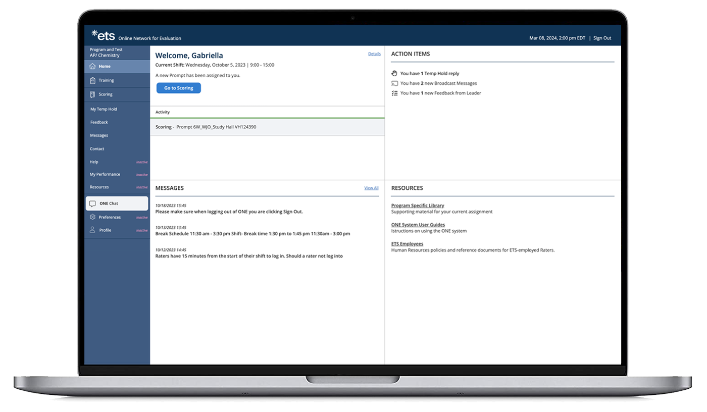
Establishing a clear hierarchy of tasks for the user to engage & prioritize called for a complete repurposing of the Home screen view. The new design shows an up to the moment view of the Raters tasks whether due next, required before moving on, already in progress, etc.
The need for visual separation between the Training and Scoring views specifically, made a case for the introduction of different colors per section. Further supporting the standard navigation highlight and section titles.
Accessibility was an important consideration in this case regarding the screen navigation and the ability to move throughout the app via various ‘mouse alternative’ input mechanisms, as well as use of accessible colors and contrast.
Conclusion
From the research phase to the design phase, the desire to address the problems originally outlined by the Product Team with regards to the Rater role, lead to an exploration & discovery of fundamental application design areas to improve on. As well as a unique challenge to serve a need that users themselves identified as crucial to improving workflow and productivity.
As this application is currently in a design/develop overlap stage, the hope is to continue surveying users on design decisions and bringing the application closer and closer to an ideal tool for test-taker response rating.
